Brand identity & retail launch
CUROLOGY FORMULATES CUSTOM, DERMATOLOGIST-DESIGNED SKINCARE FOR YOU, DELIVERED TO YOUR DOOR.
In an ever-expanding sea of skincare products, Curology stands alone by offering direct-to-consumer prescription skincare customized to your exact concerns. Whether you have acne, rosacea, fine lines, or a combination of all three, Curology’s on-staff dermatologists design a custom mix of prescription ingredients to treat your unique skin, then package your routine in a box sent straight to your home.
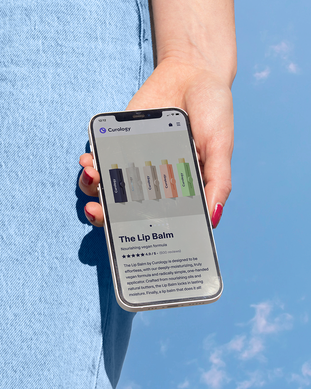
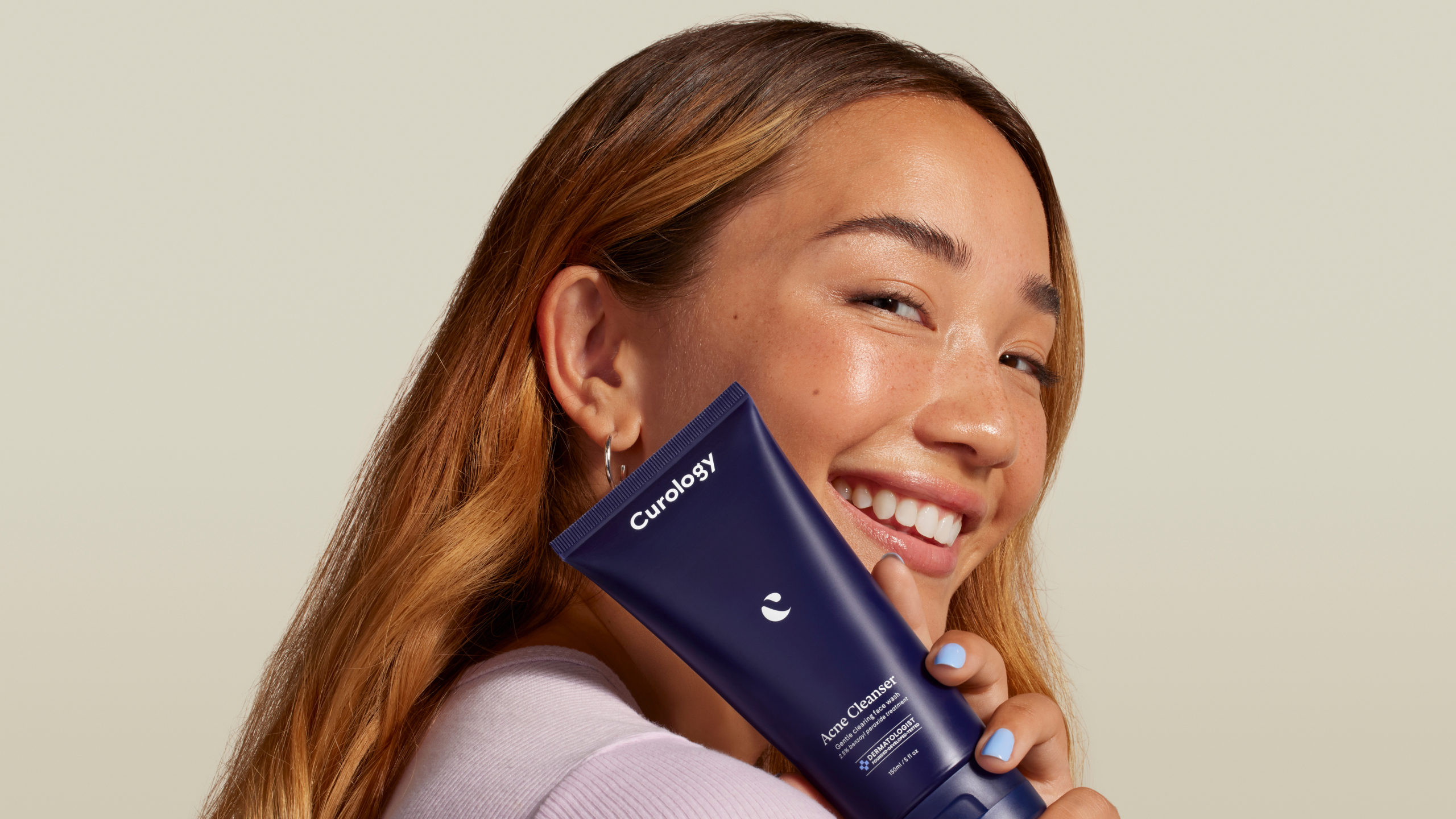
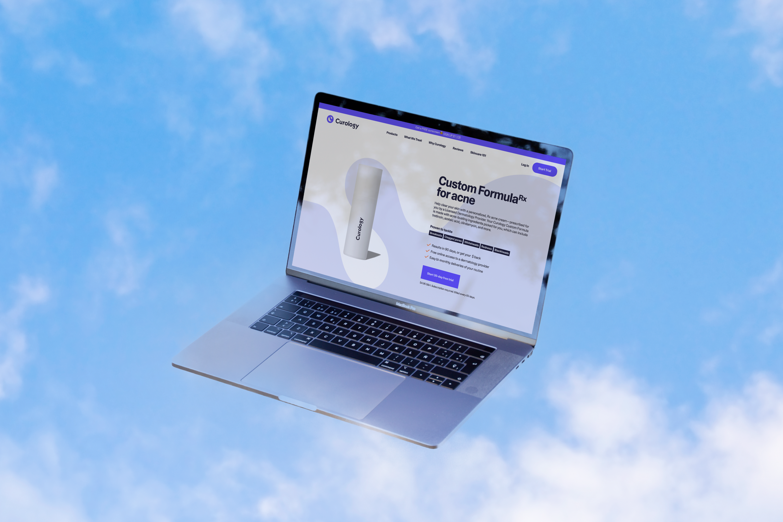
To bolster credibility in the Curology name and increase their visibility to a broader audience, we rebranded from top to bottom, introducing new products, a new brand design system, and new ways to reach customers with a launch in Target stores nationwide.
Role
Design direction
Art direction
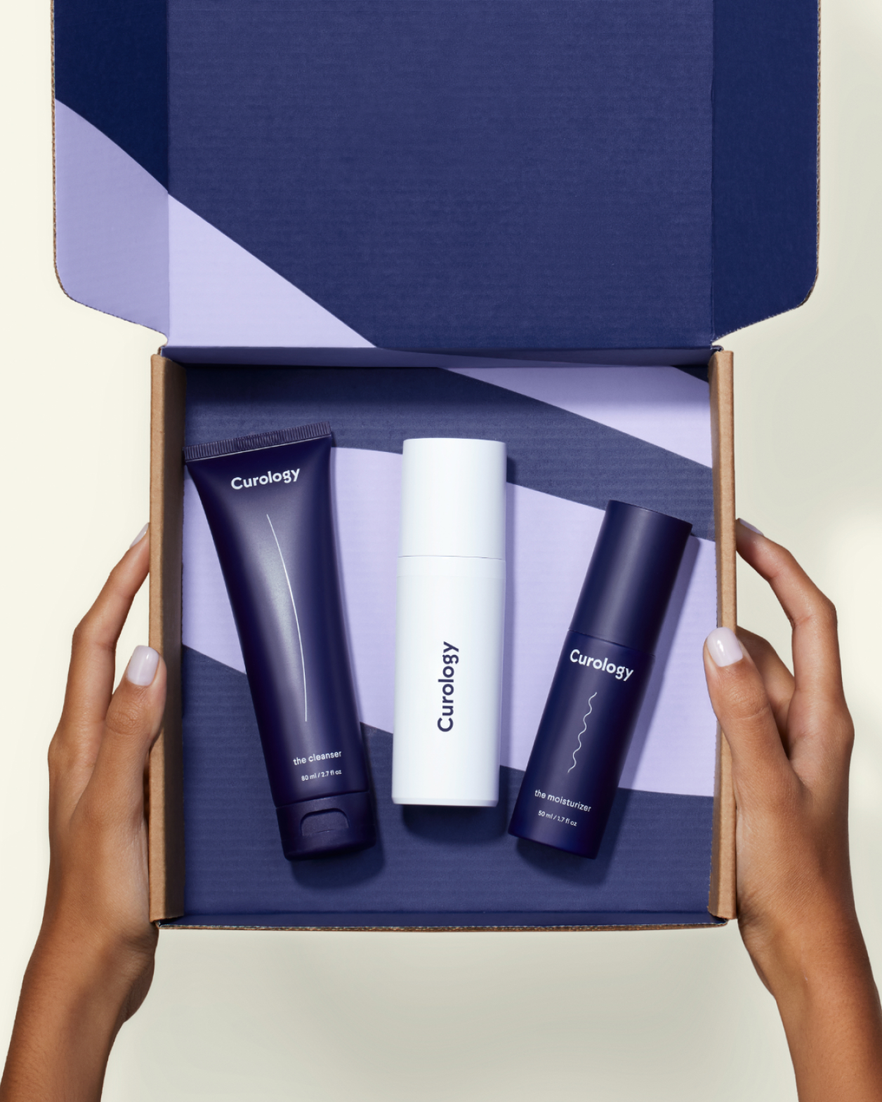
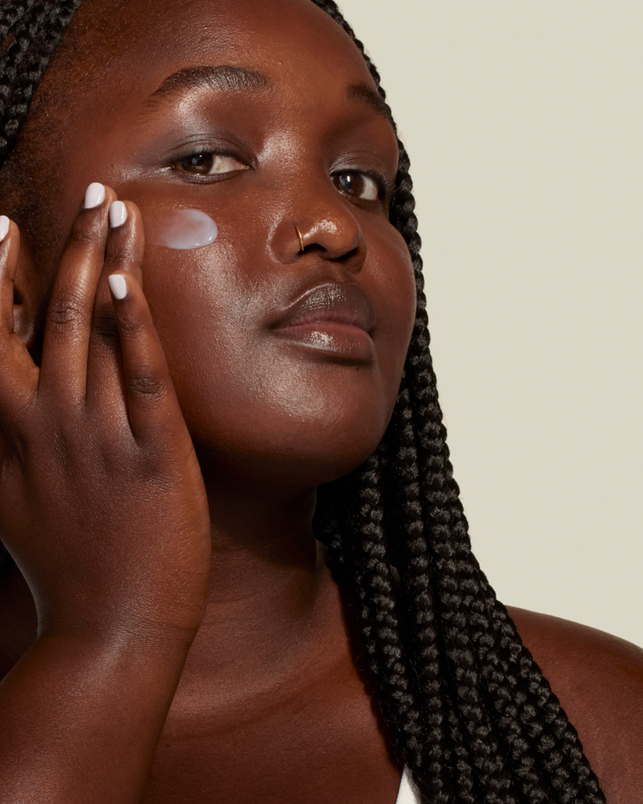
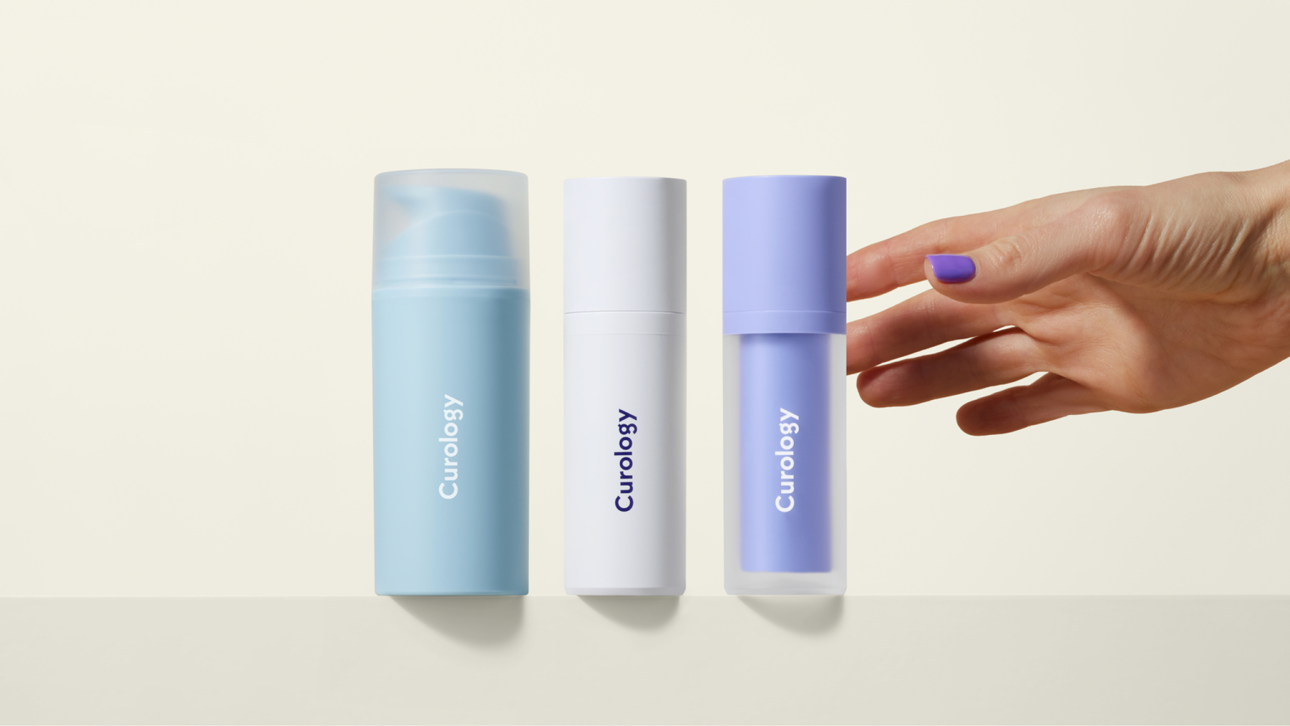
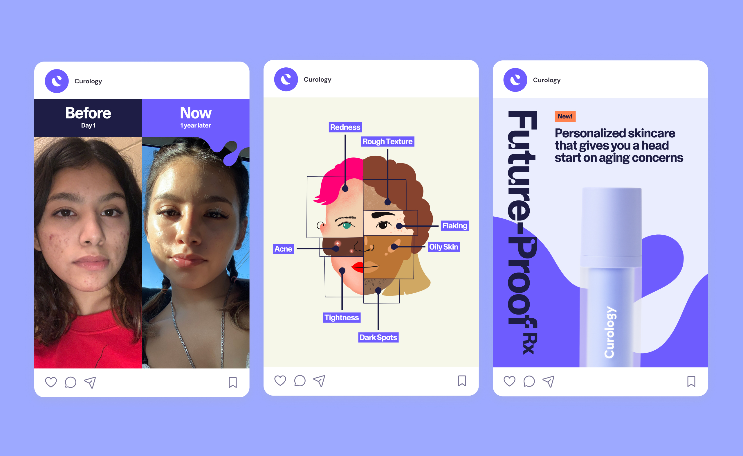
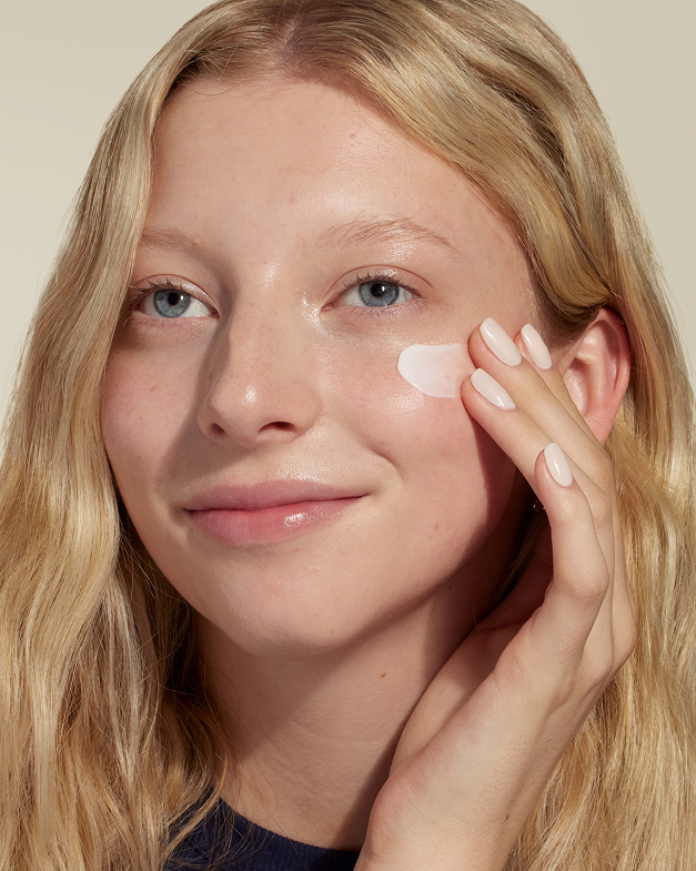
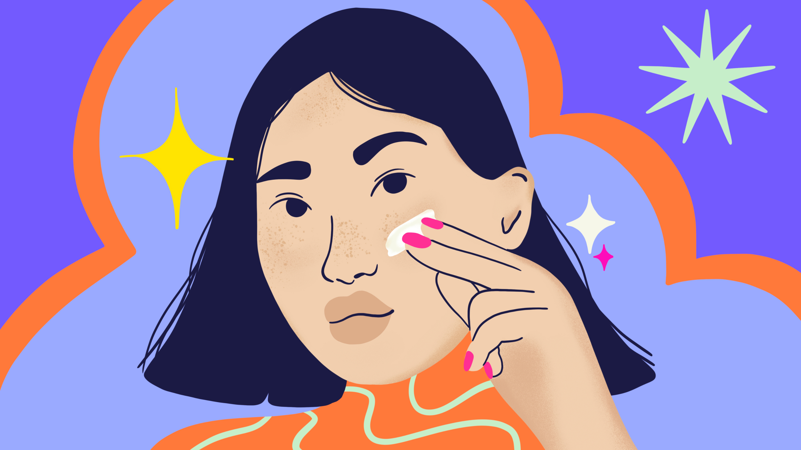
People who struggle primarily with acne (aka Gen Z) are Curology’s biggest customer base, but our medical expertise is what differentiates us from the crowd. Our challenge was to walk that line aesthetically, using visuals that both connected with a younger audience and positioned our brand with authority. We used “warm science” as our north star, grounding our messaging in our dermatologist’s knowledge but lending it a more youthful edge in our photography, graphic elements, and bold pops of color in our brand purple.
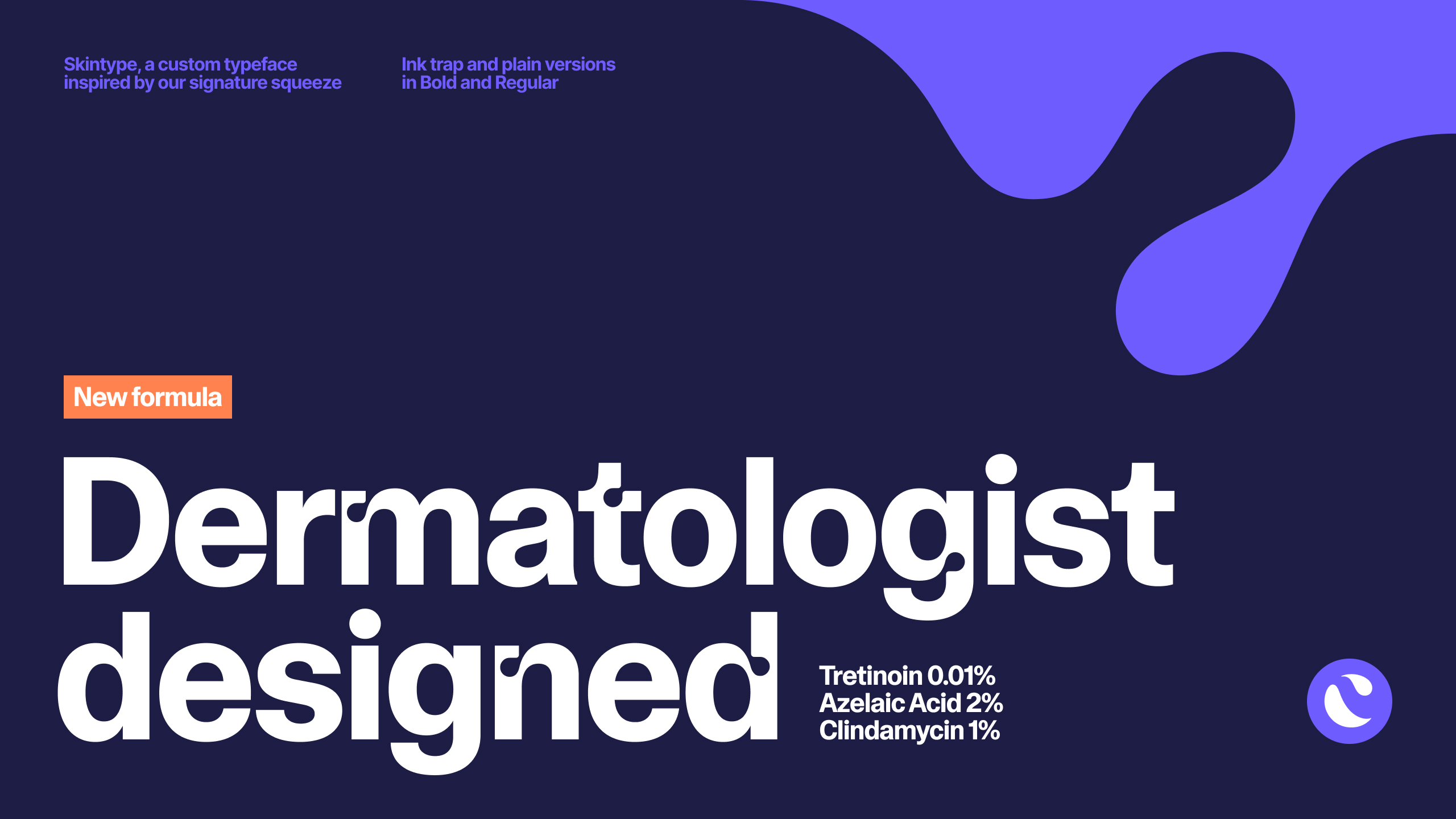

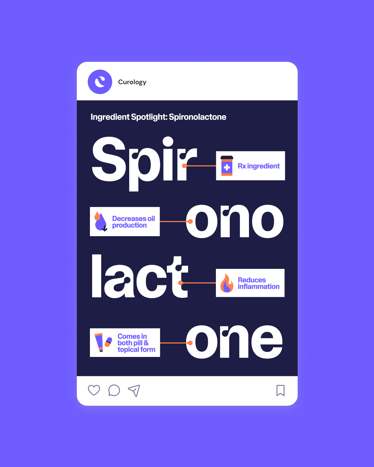

Our signature squeeze is the connecting thread throughout our visual system. Inspired by how we interact with our products, the squeeze acts as a primary graphic element to punch up our compositions and as a secondary accent in places like our custom typeface, Skintype. Combined with our core purple color, the result is an ownable brand aesthetic unique to Curology.
