
Infographics
DATA IS BEAUTIFUL WHEN VISUALIZED IN THOUGHTFUL AND UNEXPECTED WAYS.
Numbers get a bad rap for being boring. But these days, the vast amounts of data we have offer incredible insight into how our world is evolving, a resource as valuable as gold. In my mission to prove that statistics are cool, I collaborated with data scientists, illustrators, and motion graphics artists to tell the compelling stories behind the numbers.
Role
Creative direction
Producing



AIRBNB X TOUR DE FRANCE
To coincide with the 105th edition of the Tour de France, we wrote a timely piece on the huge popularity of Airbnb’s cycling Experiences. Working with a talented studio of illustrators & motion designers, we crafted these animated infographics with a French-inspired color palette, highlighting data like the number of cycling Experiences booked to date or the top three cities with the most popular bike-centric Experiences.
Featured in the Comm Arts Advertising Annual 2018
Awarded The Digital Design Award of the Week, OMMA Finalist
Agency Ready State
Illustration & Animation Illo
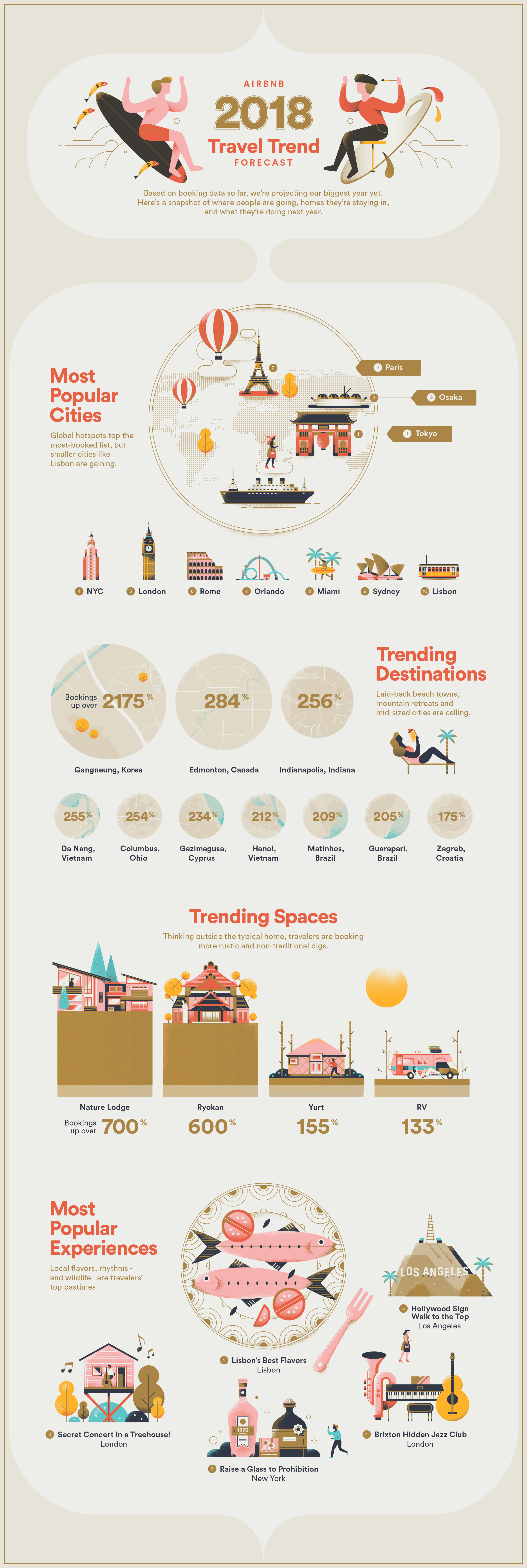
AIRBNB 2018 TRAVEL TREND FORECAST
If you guessed that Gangneung, South Korea would be the top trending destination for 2018, you're a clairvoyant witch and could probably make a fortune on Wall Street. For the non-witches among us, we created an infographic projecting Airbnb's most popular destinations, listings, and Experiences based on our booking data.
Featured in Vogue, Forbes, USA Today, Travel Noire, The Guardian
Agency Ready State
Writer Annie Gaus
Illustrator Elen Winata


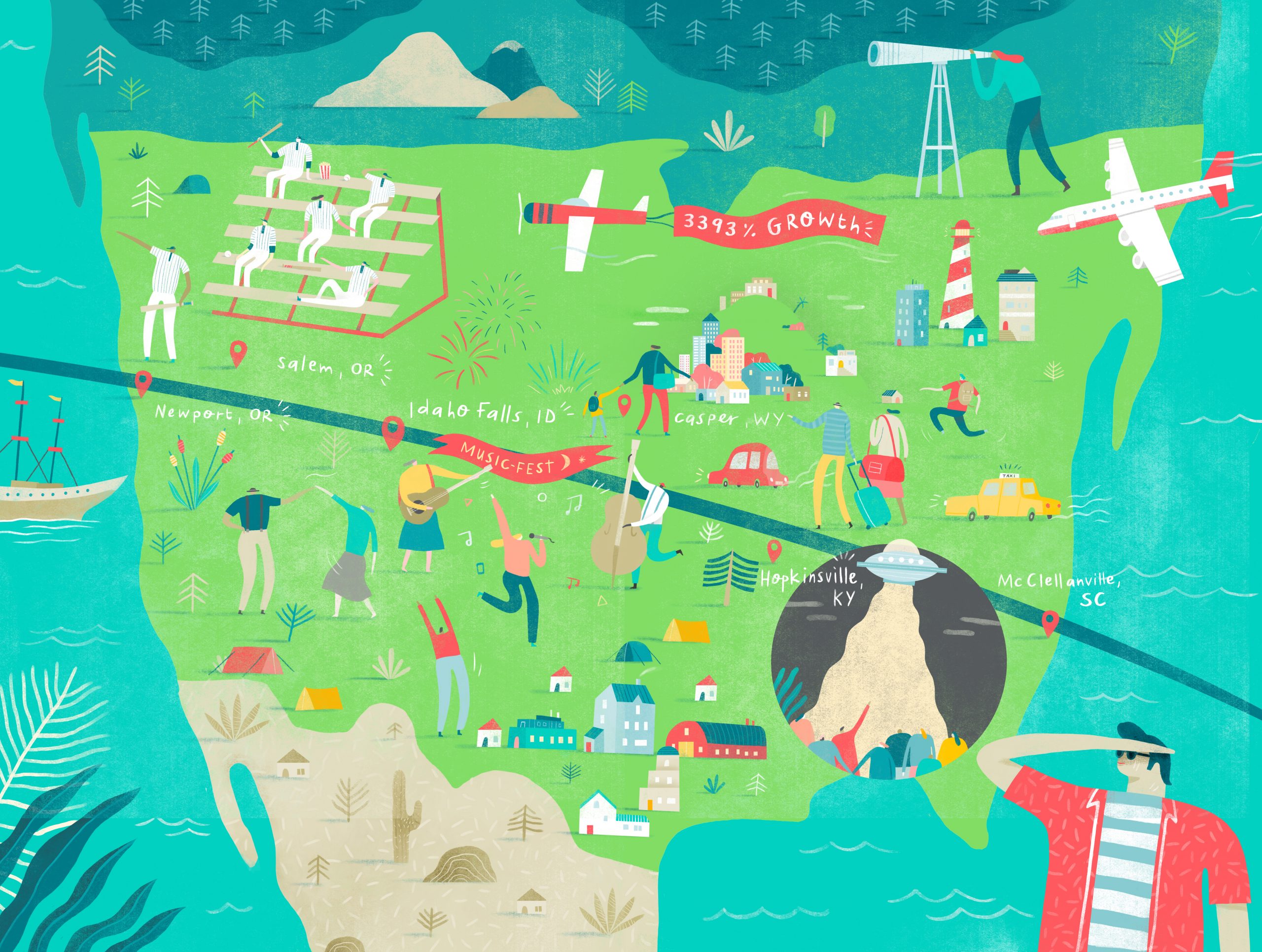
AIRBNB X THE GREAT AMERICAN ECLIPSE
On August 21, 2017, a total solar eclipse passed over the United States for the first time in 40 years, cutting all the way from Oregon to South Carolina. Along that path, Airbnb bookings spiked dramatically, with some guests reserving their homes as far back as 2015. We wrote a story about solar eclipse enthusiasts staying in Airbnbs along the eclipse path and created an illustrated, interactive map to bring it to life.